
Made by: AnGella
CLICK on “Continue reading” below for code & Preview button!
Designer Comments:
Image from Johan J.Ingles-Le Nobel. Animated by Me in Gimp. 🙂
CLICK on “Continue reading” below for code & Preview button!
Myspace2
body
{background-color: #081122;
background-image: url("http://i286.photobucket.com/albums/ll88/AnGella_/AnGellaDesigns/Reflections/St_MawesBg3.png");
background-position: center;
background-attachment: fixed;
background-repeat: repeat;
font-family: Constantia, Georgia, Helvetica, FreeSans, Arial, georgia, Helvetica, FreeSans, sans-serif;
font-size: 12px;
color: 999999;}
a:link,
a:active,
a:visited,
a.redlink:link,
a.redlink:active,
a.redlink:visited
{color: #7b9add;
font-family: Tempus Sans ITC, Constantia, Georgia, Helvetica, FreeSans, Arial, georgia, Helvetica, FreeSans, sans-serif;
font-weight:bold;}
a:hover
{color:#ecc124;
font-weight:bold;}
div#gbltopnav,
div#gbltopnav ul li a,
#gbltopnav li.dropdown ul.gblsubMenu li,
#gblrightNav{
color:#ffffff;
font-weight:bold;
}
div#gbltopnav,
#gbltopnav li.dropdown ul.gblsubMenu li{
background:-moz-linear-gradient(center top , #2a6eeb, #081122) repeat scroll 0 0 transparent;
background:-webkit-gradient(linear, left top, left bottom, from(#2a6eeb), to(#081122));
filter:progid:DXImageTransform.Microsoft.gradient(startColorstr='#2a6eeb',endColorstr='#081122');
border: 1px ridge #0c3c6f;
-moz-border-radius-bottomleft:5px;
-moz-border-radius-bottomright:5px;
color: #ffffff !important;
}
#gbltopnav li.dropdown ul.gblsubMenu li:hover{
background:-moz-linear-gradient(center top , #555555, #000000) repeat scroll 0 0 transparent;
background:-webkit-gradient(linear, left top, left bottom, from(#555555), to(#000000));
filter:progid:DXImageTransform.Microsoft.gradient(startColorstr='#555555',endColorstr='#000000');
color: #ffffff !important;
font-weight:bold;
border:1px solid #999999;
-moz-border-radius-bottomleft:7px;
-moz-border-radius-bottomright:7px
}
#gbltopnav a:hover,
#gbltopnav li.dropDown ul.gblsubMenu a /*NavBar Text*/
{background-color: #000000;}
#gbltopnav,
#gbltopnav ul,
#gbltopnav ul li,
#gbltopnav ul li a,
#gbltopnav ul.gblsubMenu
{border: none;}
#gblleftNav li.dropdown ul.gblsubMenu li a {
color: #ffffff;
}
#gbltopnav li.dropdown:hover ul.gblsubMenu a:hover {
color: #ffffff;
}
#gbltopnav ul li a:hover,
div#gbltopnav ul#gblleftNav li a:hover,
div#gbltopnav ul li a:hover{
background:-moz-linear-gradient(center top , #081122, #2a6eeb) repeat scroll 0 0 transparent;
background:-webkit-gradient(linear, left top, left bottom, from(#081122), to(#2a6eeb));
filter:progid:DXImageTransform.Microsoft.gradient(startColorstr='#081122',endColorstr='#2a6eeb');
color: #ffffff !important;
font-weight:bold;
border:1px solid #839cdf;
-moz-border-radius-bottomleft:7px;
-moz-border-radius-bottomright:7px;
font-weight:bold;
}
#gbltopnav{background:-moz-linear-gradient(center top , #000000 , #000000 ) repeat scroll 0 0 transparent;}
.ie #gbltopnav {
filter:alpha(opacity=00);
}
div.contentTop
{height: 408px; background-repeat: no-repeat;
background-position: top right;
background-image: url("http://i286.photobucket.com/albums/ll88/AnGella_/AnGellaDesigns/Reflections/StM.gif"); background-color: #000000;
border: double 0px #000000;}
div.wrap
{width: 800px;
background-color: transparent;
background-image: url("http://i286.photobucket.com/albums/ll88/AnGella_/AnGellaDesigns/Reflections/St_MawesBg.png");
background-attachment: fixed;
border: solid 0px #000000;
-moz-border-radius-topleft:7px;
-moz-border-radius-topright:7px;
-moz-border-radius-bottomleft:7px;
-moz-border-radius-bottomright:7px;
}
.contentMid1{
background: #081122;
opacity:0.75;
filter:alpha(opacity=75);
color: #777777;
}
/*All Modules*/
div.moduleMid1
{background-color: transparent;
font-family: Constantia, Georgia, Helvetica, FreeSans, Arial, ;
color: #ffffff;
border:1px ridge #7b9add;
-moz-border-radius-topleft:7px;
-moz-border-radius-topright:7px;
-moz-border-radius-bottomleft:7px;
-moz-border-radius-bottomright:7px;
padding: 5px}
/*EvenModules*/
.interestsModule .even,
.detailsModule .even,
.commentsModule .even,
.moduleList .even, .moduleList .even
{background-color: transparent;
font-family: Constantia, Georgia, Helvetica, FreeSans, Arial, ;
color: #ffffff;
border-bottom: 1px solid #7b9add;}
/*OddModules*/
.interestsModule .odd,
.detailsModule .odd,
.commentsModule .odd
.moduleList .odd, .moduleList .odd
{background-color: transparent;
font-family: Constantia, Georgia, Helvetica, FreeSans, Arial, ;
color: #ffffff;
border-bottom: 1px solid #7b9add;}
div.profileDemographics
{height: ;
width: 90%;
background-color: transparent; font-family: Constantia, Georgia, Helvetica, FreeSans, Arial, ;
color: #7b9add;
border:1px ridge #7b9add;
-moz-border-radius-topleft:7px;
-moz-border-radius-topright:7px;
-moz-border-radius-bottomleft:7px;
-moz-border-radius-bottomright:7px;
padding: 5px}
h2 /*NameText*/
{font-weight:bold;
color: #7b9add;
font-family:Tempus Sans ITC, Constantia, Georgia, Helvetica, FreeSans, Arial, georgia, Helvetica, FreeSans, sans-serif;}
h3.moduleHead,
h4
{font-family:Tempus Sans ITC, Constantia, Georgia, Helvetica, FreeSans, Arial, georgia, Helvetica, FreeSans, sans-serif;
text-align: center;
background:-moz-linear-gradient(center top , #2a6eeb, #081122) repeat scroll 0 0 transparent;
background:-webkit-gradient(linear, left top, left bottom, from(#2a6eeb), to(#081122));
filter:progid:DXImageTransform.Microsoft.gradient(startColorstr='#2a6eeb',endColorstr='#081122');
font-size:16px;
font-weight: bold;
color: #ffffff;
padding: 0px;
line-height: 30px;
border:1px ridge #0c3c6f;
-moz-border-radius-topleft:7px;
-moz-border-radius-topright:7px;
-moz-border-radius-bottomleft:7px;
-moz-border-radius-bottomright:7px;
}
.contactLinks li {font-family:Tempus Sans ITC, Constantia, Georgia, Helvetica, FreeSans, Arial, georgia, Helvetica, FreeSans, sans-serif;
text-align: center;
background:-moz-linear-gradient(center top , #2a6eeb, #081122) repeat scroll 0 0 transparent;
background:-webkit-gradient(linear, left top, left bottom, from(#2a6eeb), to(#081122));
filter:progid:DXImageTransform.Microsoft.gradient(startColorstr='#2a6eeb',endColorstr='#081122');
font-size:15px;
color: #ffffff;
padding: 0px;
line-height: 30px;
border:1px ridge #0c3c6f;
-moz-border-radius-topleft:7px;
-moz-border-radius-topright:7px;
-moz-border-radius-bottomleft:7px;
-moz-border-radius-bottomright:7px;
}
.contactLinks li a{
color: #ffffff;
background-image: none;
}
.contactLinks li a:hover{
color: #ecc124;
}
.contactLinks li:hover{
background:-moz-linear-gradient(center top , #081122, #2a6eeb) repeat scroll 0 0 transparent;
background:-webkit-gradient(linear, left top, left bottom, from(#081122), to(#2a6eeb));
filter:progid:DXImageTransform.Microsoft.gradient(startColorstr='#081122',endColorstr='#2a6eeb');
color: #ecc124 !important;
font-weight:bold;
border:1px solid #839cdf;
-moz-border-radius-bottomleft:7px;
-moz-border-radius-bottomright:7px
-moz-border-radius-topleft:7px;
-moz-border-radius-topright:7px;
}
.contactLinks{
padding-bottom: 10px;
}
strong
{font-weight: bold;
color: #7b9add;
font-family: Tempus Sans ITC, Constantia, Georgia, Helvetica, FreeSans, Arial, georgia, Helvetica, FreeSans, sans-serif;}
/*ZigZag Comments*/
div.commentsModule ul.moduleList li.odd div.user {float:right;}
div.commentsModule ul.moduleList li.odd div.userComment {margin-left:0px; margin-right: 15%;}
div#header,
div#googlebar
{background-color: transparent;
background-repeat: no-repeat}
div#footer
{width: 800px;
height: 75px;
margin: auto;
background-color: transparent;
background-image: url("http://i286.photobucket.com/albums/ll88/AnGella_/AnGellaDesigns/Footer.png");
background-position: top center;
background-repeat: no-repeat;
padding-top: 20px;
line-height: 30px;
text-align: center;
vertical-align: bottom;
font-size: 10px}
/*Layout generated @ http://skemaholicsanonymous.com*/
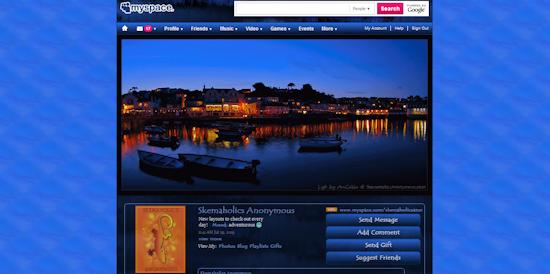
Designer Comments:
Image from Johan J.Ingles-Le Nobel. Animated by Me in Gimp. 🙂

 Add to favorites
Love, love this, gorgeous! Great job on the ani:}